Less is More: A Way Into Abstraction
- Steve Roberts
- Feb 20
- 5 min read

When I started to paint without a reference point, I realise how difficult abstraction could be.
A common misconception about abstract painting is that it’s easy to make and that it lacks any real skill. Whilst it’s true that creating realistic, figurative paintings requires a high level of understanding and technical ability to achieve quality results, there is always a point of reference to guide the work. With abstraction, there is no primary reference, and the artist relies entirely on their aesthetic judgement, understanding of colour theory and intuition to guide them. This limitless choice is a paradox, both liberating and restrictive. An abundance of possibilities can lead to huge amounts of frustration, false turns and wasted time and materials. People will look at abstract works and disparagingly say “my child could do that” but to produce abstract paintings with real impact and quality, without contrivance is far from easy.
It was only when I had made the decision to pursue abstraction seriously that I realised just how difficult it could be to produce work that I was happy with and didn’t look or feel like a pastiche of various abstract painting tropes. Though I have produced successful abstract paintings, I have had just as many failures which have either lacked direction with no structure or conversely employed too much structure and therefore appear rigid and dead to the eye. This balance between structure and spontaneity is what I feel is by far the most difficult aspect of abstract painting to balance. It is a problem I wrestle with on a daily basis in my studio and has led me towards developing a reliable method to begin a painting along the right lines. A way to provide enough structure for a visual hierarchy to develop within the picture plane but also open enough to allow for exploration within that structure.
Beginning with Drawing
When thinking about developing a painting process, I think it is essential to go back to drawing. Drawing is the source of all visual art; for most of us, it is our first introduction to art as children and the need to make a mark, to record our world or express our inner experience is strong and constantly present. Drawing reveals so much about our motivations and emotional responses, it is a direct expression of both our conscious and unconscious thoughts. Painting can only come into existence through drawing, the foundation which underpins it.
I began this process of finding the right structural balance within my work by taking a marker pen and a pad of A4 printer paper and started to make marks across the surface. I would repeat this process, sinking deeper into the experience to initiate a meditative-like state. I was able to quieten my conscious decision making and instead respond intuitively to the marks I had made. This repetition led to some interesting compositional arrangements, but when I tried to translate this structure to the medium of oil paint, it fell apart. There was too much information jangling on the page, no sense of direction which led to incoherent results.
I knew from looking at these drawings that I needed to strip away more information. I repeated the process, this time with only drawing a few marks on each sheet. The lines would still intersect with each other, cutting the geometry of the page but now they left more space, areas of stillness that provided context to the busier areas of overlapping lines and changes of direction. Over time, I began to realise that these few lines would be more useful as one line, a singular expression of movement and rhythm that would exist in relation to the dimensions of the page. Here the blank paper would suggest possibilities of how to respond to that singular mark. It may seem strange but having just the one mark on the paper in front of me provided me with the greatest level of clarity about the direction I could head in, an abundance of possibilities through an absence of visual information.


It seems paradoxical but less information can actually open up a greater number of possibilities for exploration.
The Power of Monochrome
When we strip away colour and work monochromatically, we eradicate distractions. Colour gives life to a painting, but it also obscures composition and form, creating a barrier to our understanding. Working in black ink allows us to see the qualities of line and composition in its purest form, everything is either a mark or space, and we can identify the dynamic between this relationship clearly.
With this principle in mind, I took a bottle of Indian ink and several sheets of cartridge paper to utilise the singular mark to suggest a direction for subsequent marks. This ink was poured straight from the bottle so there would be no variance in value, just the stark contrast of black and white. I applied a single mark to each sheet in succession. I would then look to see what other marks this one, continuous movement suggested to me. From here, subsequent marks with the brush can intersect or float, either extending or changing direction from that mark or adding a counterpoint to that visual weight in another area of the page. Using a brush to apply these marks helped me to psychologically bridge the gap between drawing and painting and I could see how this method could translate seamlessly into the medium of oil paint.
A Limited Palette – Introducing Colour
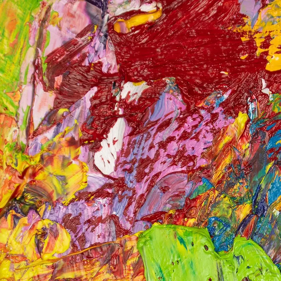
Simplicity was at the forefront of my mind, and I decided to take these ink drawings and follow the same principle of using a single brush mark to suggest two or three others, guiding the creation of an abstract test in oils. To minimise the risk of overthinking the process, I decided to use a limited palette for this test painting, deciding on the colours of phthalo blue, cerulean blue, magenta and titanium white. Limiting the palette to just four colours made deciding on what colour to mix next much easier. It also ensured a greater unity between each colour as more commonalities exist between each mixed pigment and the blue and purple hues would be intensified with the use of orange as a complementary ground colour.
I chose to work with cheap materials again to eradicate any pressure to achieve results. Doing this helps to remind me that the intention is not to produce finished paintings but to engage with the process of attaining understanding through making. I didn’t prime the piece of cardboard because I knew it would be thrown away after a matter of weeks; the value of this exercise lies in what is revealed through the act of painting not the resulting object.
When I'm painting, the value for me lies in the unfolding process of changing experience, not a desire to create towards a predetermined outcome.
The Value of Simplicity
When we are stuck, it is often simplicity that shows us a way forward. These exercises have not only shown me a better way to start my paintings but taught me a valuable lesson about finding solutions. Stripping back unnecessary information is useful as this often clouds our judgement. What interests me about abstraction is the ability for a painting to unfold and change context continuously, it should have been obvious that too much structure would have been a hinderance to this aim. That initial brush mark provides the start of that thread, a way into engaging with that process of continual change.


Comments